Flyflow
A concept mobile application to reduce travel anxiety for infrequent fliers
Flyflow is a mobile design conept as part of my senior capstone project with our client Alaska Airlines. We worked closely with the Day of Travel team to understand the experience of infrequent flyers. We designed a mobile application that allows infrequent travelers to receive timely and relevant information that assists them with their day of travel, up until the moment their flight takes-off. This design solution aims to increase traveler confidence when placed in unfamiliar airports, as well as empower those who do not travel as much.
Role
Created design system and directed the interaction design
Duration
13 weeks


Travel is often taxed with uncertainty, stress, unexpected changes, and frustration. How might we reduce anxiety during a day of travel?
With the need to create plans for driving to the airport, checking in bags, going through security, or even finding charging ports at the airport, travelers must do many mini calculations to determine whether or not they will be ready for take-off. Day of travel activities are stressful, because of the mental math that must be done in context.
User Research
Focusing on Infrequent Fliers
At Alaska, we collaborated with the Day of Travel team to find out more about traveler profiles. We found that the infrequent travelers are the target users for the problem we are solving. An infrequent traveler is someone who travels less than 3 times annually and is not completely comfortable with the experience of flying.
Needs
Guidance
Estimates of time
Navigation through airports
Preparedness
Pain Points
Being late
Uncertainty
Mental Math
Lack of control
Security lines


Scoping Survey
To prioritize certain aspects of the project, we scoped the project by targeting the most stressful time periods and activities in a day of travel.
Our survey also acted as a screener for our participatory design session. We asked them to select the most stressful time period for them, then rank the activities during that time by how stressed they feel while doing them.
We evaluated whether users wanted a proactive, or reactive form of guidance during their day of travel. We collected a total of 157 responses and found a total of 52 respondents fitting our definition of an infrequent traveler.
We were able to narrow down the scope of our project to designing solutions for activities that take place before the traveler boards their plane. This is because 75% of infrequent travelers voted it as the most stressful time period for them.
Participatory Design Workshop
After recruiting our target users from the survey, we took the next step and made them the experts. We used Frog Design’s Participatory Design methods to co-design with our target users. We feel that this step can help us better understand our users needs because our users are designing what they feel will help them. The activity involved three steps: journey mapping, sketching solutions, and concept ranking.

Sketching + Concept Ranking
After journey mapping, participants were asked to recall their pain points on the timeline and to brainstorm as many solutions that they could think of to address those pain points. After that, they shared their ideas with their group and exchanged feedback. Participants were then asked to refine their ideas and encouraged to sketch out how their solutions would work. To set up for the concept ranking, the groups chose 3 of their favorite solutions to present to everyone. The 3 solutions with the highest number of votes were discussed. Participants discussed what works well with the solutions and what could be improved.


Journey Mapping
Participants were asked to think of the activities they do before boarding for their flight. They wrote down each activity on sticky notes and compared activities in their small groups. Then, we had participants talk about each activity on their timelines and map their emotions to each activity. Below is an image that summarizes the activities and pain points participants came up with.
Field Testing
User Needs
Putting together some of the findings we received from our surveys and participatory design, we found three recurring needs that our participants expressed.
Every person has a different journey within the airport. Infrequent travelers can benefit from guidance at an unfamiliar airport.
Travelers need assistance while managing their time during the pre-flight period.
Preparedness on the day of travel can reduce uncertainty, and thus anxiety.

Wireframes and Guerilla Testing
We utilized the user feedback to inform our high fidelity mockups presented later in this document. We went to Seattle-Tacoma Airport and conducted our guerrilla usability test with a total of 8 participants. We were escorted past the security checkpoint by our Alaska Airlines sponsor, to target those who had previously completed the task of getting to the airport on time. Our process consisted of quickly screening them and presenting them with two tasks to evaluate. Some of the feedback we got were:

Finding Transportation: Travelers compare and contrast price and time across different forms of transportation, in order to select one method that will get them to the airport on time.

Navigating Through Airport: After the security checkpoint, travelers can see all the amenities they will pass by as they walk through to their boarding gate. Travelers can prioritize how and where they move through the airport to visit all the places they need to, before boarding the plane.

Searching for an Amenity: Travelers can search and explore everything the airport has to offer, including visiting places outside of their direct path to their boarding gate.
Feedback
Map interactions are preferred over search
4 out of 4 participants expected to search the map by swiping and zooming in to find locations instead of interacting with the search tab.
Users expect the search and navigation to be a part of one screen
Related to the first finding, users expected to interact with the search in context of the map that would react to the user’s search activities.
Majority of users did not utilize the filter buttons
When participants were asked to add a McDonald’s and a restroom to their route, we expected them to add these places using the “Filters”. However, 2 participants went straight to “Search” before being told to find another way to complete the task. 3 participants were not able to complete the task and we had to guide them on how to complete the task, while one participant utilized more time and effort to complete it.
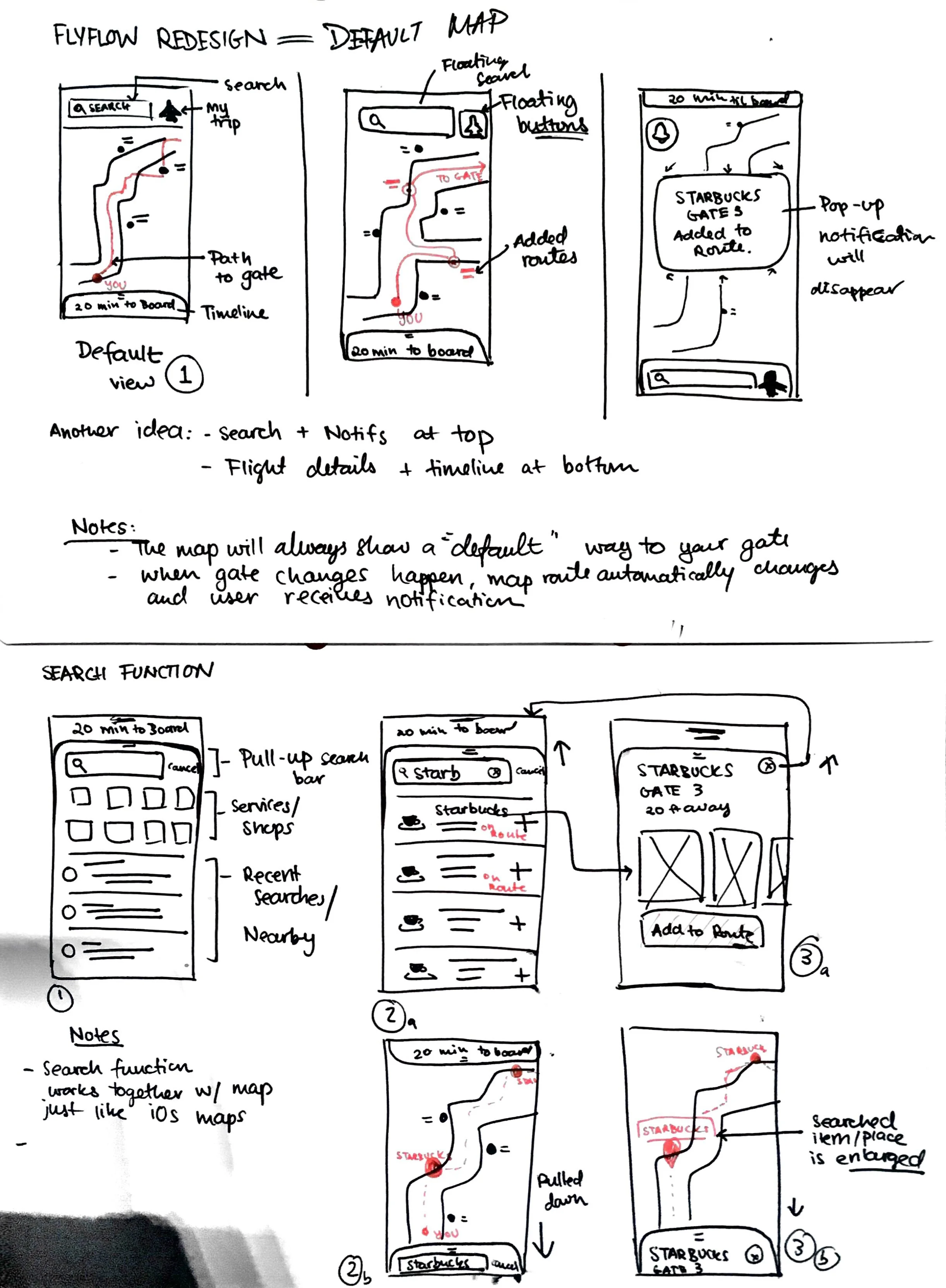
Design Revisions
Combine “Search and Navigate”
When asked to locate a place on the map, participants would utilize “Search” in the bottom tab bar to search for a specific location, rather than utilizing “Filters.” This showed us that users felt that “Search” could better help them determine where things are on the airport map.
Timeline preview on the on-boarding process
Users expect to visualize their schedule as they plan out their day of travel during the onboarding. This ensures more certainty and confidence.
Show relevant locations along the route
On the map, users expected to see possible locations they could visit along their route.
Final Designs

This puts together the search and navigation together in one screen. The timeline is accessible from the bottom and the other functions such as search, my trips, and notifications are placed at the top bar.
In this project, I was also in charge of directing all the interaction pieces that create a simple and intuitive pre-flight experience. I kept in mind the user requirements that were established earlier in our process, and applied those in the interaction design of Flyflow.
-
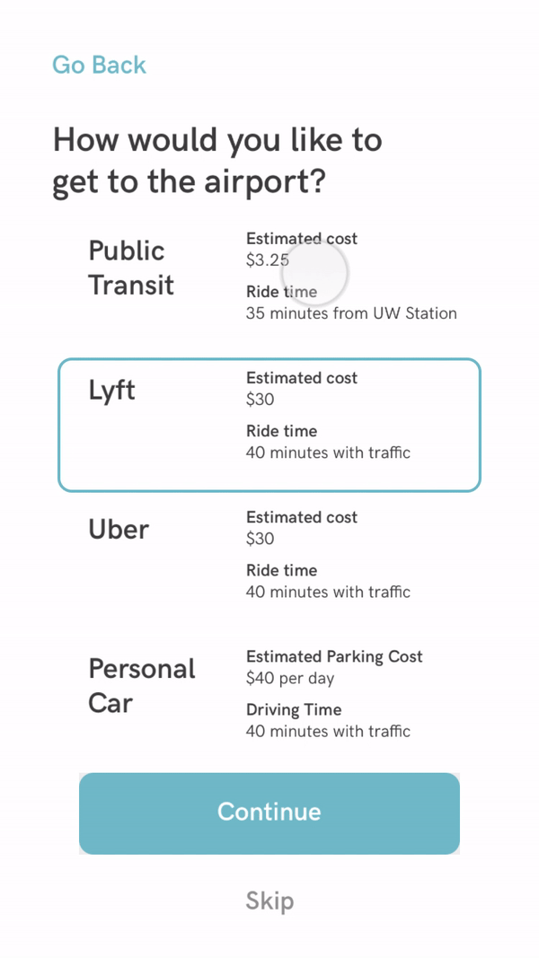
Get to the airport on time
Based on your flight details, we help you personalize your pre-flight journey by asking you where you are leaving from and how you are getting to the airport. Then, we give you options on when to leave for the airport so that you can be on time!
-
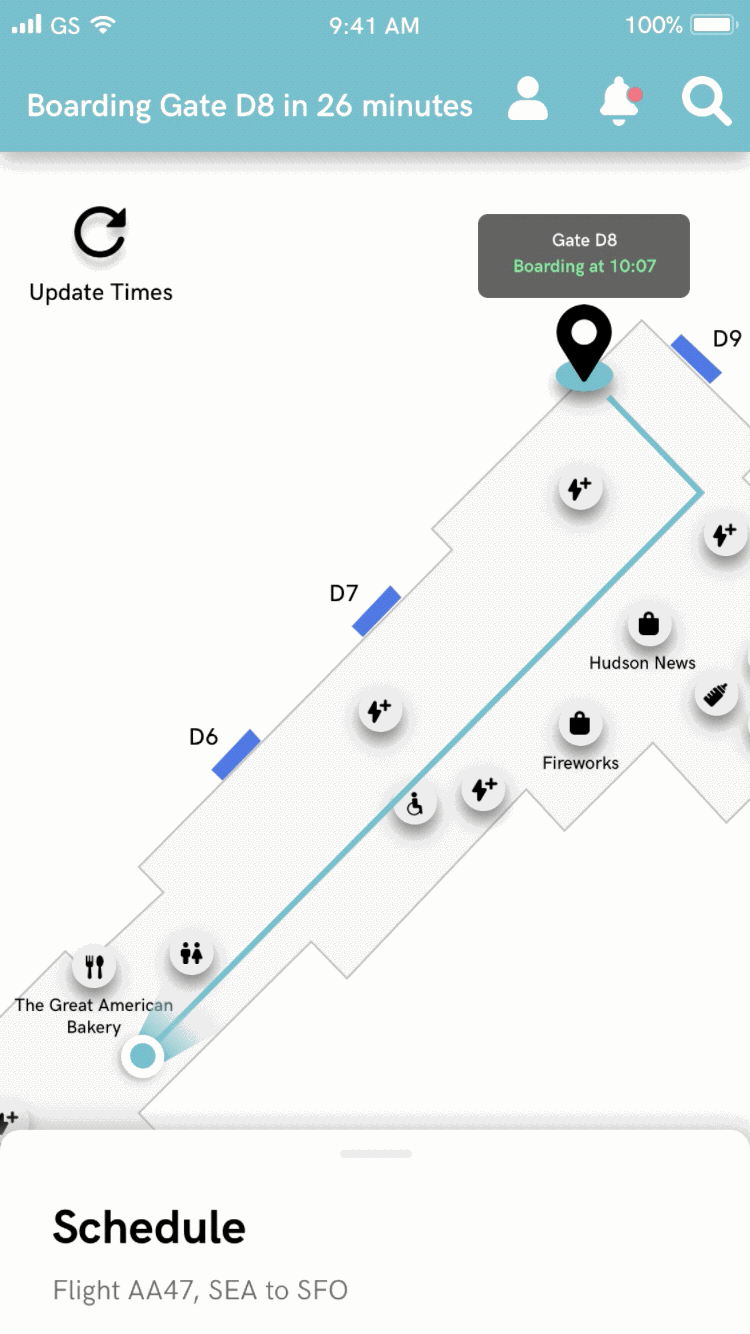
Your personalized schedule
Based on the onboarding information, users will always have access to a personalized schedule from the moment they leave their house to boarding their flight. This ensures that users have a sense of control and time management.
-
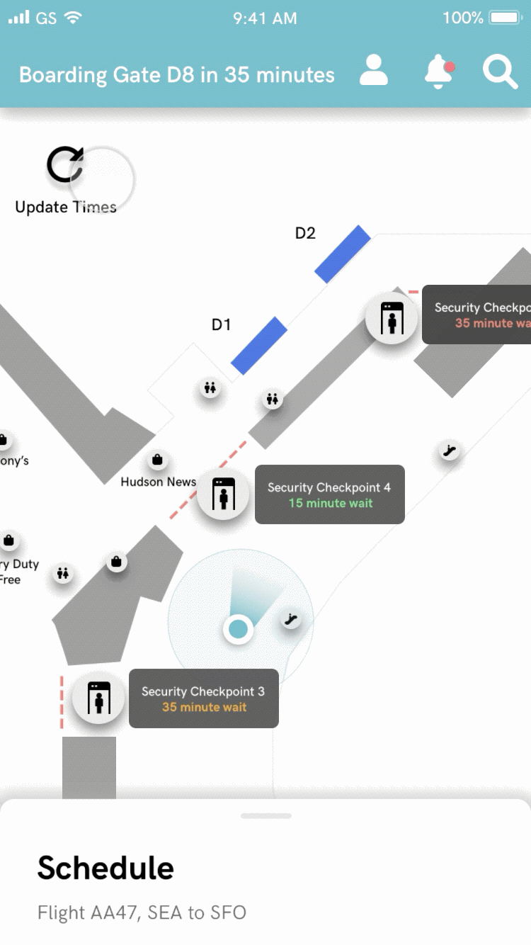
Real time TSA line updates
Reducing security line stress was challenging, but we still wanted users to have a sense of certainty as to which security line they should go to. This way they can better manage their time and feel more prepared to go through TSA lines.

Design System
As a team, we wanted the design to be simple, calm, and to the point. Here is a collection of some of the components I’ve created for our high-fidelity designs. These components became the building blocks of our high-fidelity design, and was used by the rest of the team to scale our design.

Retrospective
This capstone project gave me the first real life experiencing of going through an entire user experience design process. We faced many unforeseen circumstances, such as our delayed guerilla testing that only gave us a short amount of time to come up with viable designs. As a team, we felt that involving users in our design process was extremely fast, effective, and efficient for evaluating and iterating. We also learned that perhaps we may have relied a little too much on the participatory design session. In the future, user input also needs to be analyzed to make the right design decisions.
Further, Seattle is a large city with many frequent travelers. It was rather challenging to find research participants that were truly infrequent travelers. For now, we hope that this tool serves a niche group of infrequent travelers that would benefit from the features we came up with. Perhaps testing in the context of an unfamiliar airport would give more value to the search and navigation feature of the app.
Special thanks to Alaska Airlines’ Day of Travel Team for the sponsorship and support, as well as the amazing HCDE capstone team-
Karena Vongampai, Project Manager and Sponsor Coordinator
Brent Gruenke, Evaluation and Recruitment
Andre Guiao, Research and Documentation